Thursday, April 30, 2015

Final


So GIS ninjers, this will be my final blog for a while.  I will be graduating this semester and this is my final class.  It is been a LOT of work but I am glad that I've finally finish.  Working full time as an active duty Sailor and taking almost a full load every semester for 3 years will really wear you down.  This project wasn't bad and was a very good representation of all the skills that I have learned over this semester.  I plan on continuing my GIS certificate next year so stay tuned for future progress.  Below you will find my final work, I sure hope it is enough because there were many parts to this project that I forgot and had to go back and tweak.  I suppose I should have followed my model, oh well, you live and you learn!


Final Transcript
Download link for Final Analysis


Saturday, April 11, 2015

So Close!

We are nearing the end of this semesters GISjourney.  I have mixed emotions about this, I have struggled many times during this semester but I feel like I have come out of this class with much more skill than I did when I came into it.  Sadly I will not be continuing my GISjourney at this moment because I will be graduating after this class.  This does not mean that I will be giving up GISing, more like taking some well needed time off.  This is the last official lab for this class before the final and I have honestly started to like the more and more. This weeks lab, while offering the usual headaches of learning something new in ArcMap, was enjoyable for me and only gave me slight trouble(when I didn't read the directions).  The objective was for us to use georeferencing to manipulate polygons to match a raster image.  After this we were also introduced to ArcScene, which is a way to project a 3-D image of data based upon the attribute data.  The past 2 weeks are what I was looking forward to doing when I started to GIS.  I am much more interested in the analysis and manipulation of data rather than creating maps, because I don't have the best creativity.  Luckily, that isn't graded in this class!
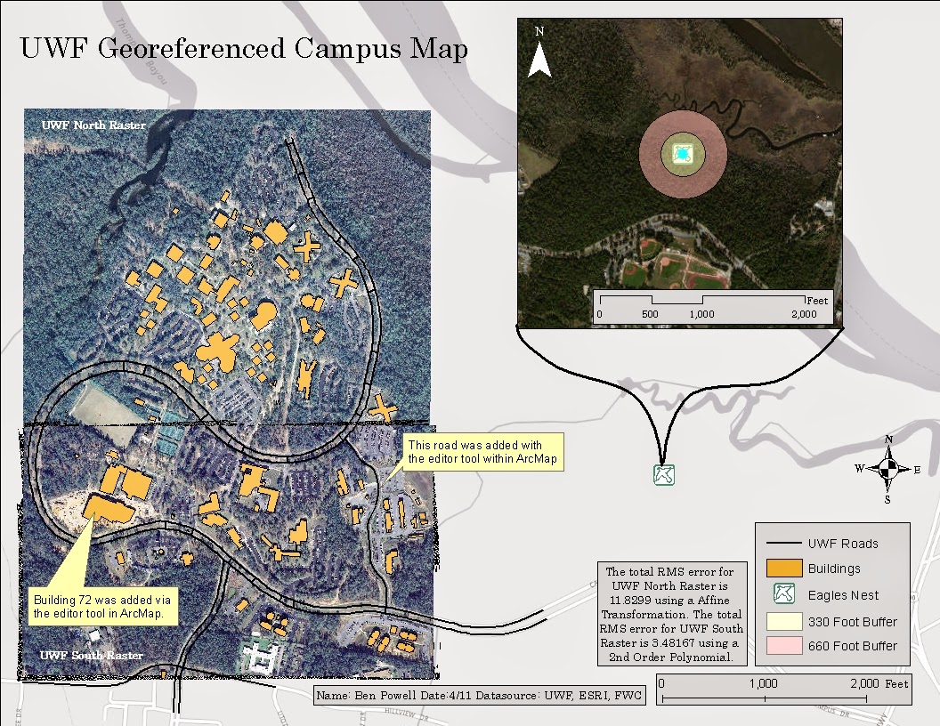
UWF Georeferenced Campus Map
This is my georeferenced and edited raster and shapefile image.  I feel like this is one of my better maps that I have produced this semester, even if part of my neatline is cut off :)  Below is a 3-D Digital Elevation Map created using ArcScene and ArcMap.  ArcScene is very much like Google Earth in the navigation tools but offers much more capability.  Well that's all for today GISers! See you for the Final!
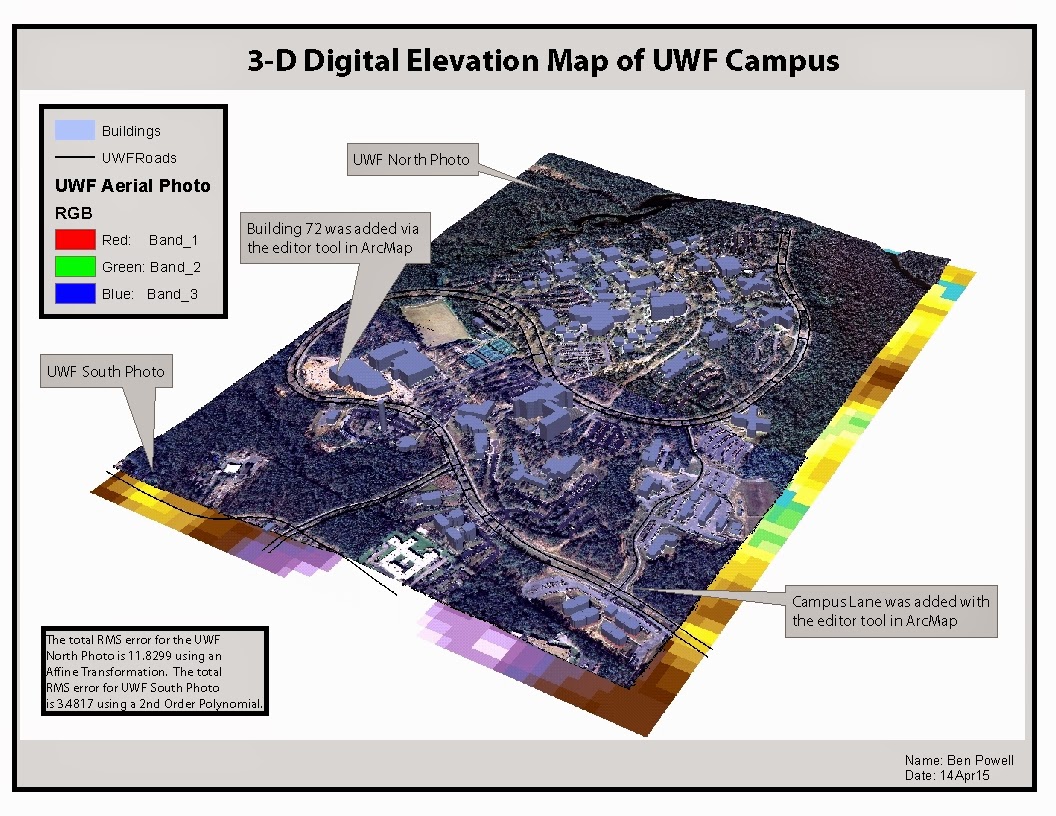
3d DEM

Wednesday, April 1, 2015

Easy, but super cool

This weeks lab was very straightforward and I, for one, am glad that it was .  We investigated the more analytic side of ArcMap and it is way powerful.  I was glad that it was easy and straightforward because without solid instructions it would have been a very difficult task to figure most of this lab out on our own.  For the first part we created our own geolocator database based upon EMS locations in Lake County Florida.  Then we plotted each location and created a route to take us from one EMS location to 2 others.  I would have never figured out how to do that part on my own.  
Lake County EMS Map
For the second part we messed with the Model Builder toolset which allows you to pair the input and output of different tools to create what I would call a complex equation.  This allows you to perform multiple actions without having to do it manually using the outputs of other tools.  Below is a screenshot of the Model Builder tool.  Each tool(the yellow boxes) has a shadow underneath it because it has been ran and it created some layers on my map for me.  I was hesitant about this part before I used it but it is extremely powerful and I can see how creating a template model would benefit someone who runs the same tools often.  Well GIS Ninjas, see you next week!

Model Builder

Thursday, March 26, 2015

Lab 11- Working with Vectors

Every time I hear vector, this is what I think of, Vector from Despicable Me.  Overall this lab was not bad, it was actually kind of fun because we got to see some of the power of ArcMap, which is mindblowingly powerful.
This week we had to use a selected set of data to create a map of some buffered campsites located in Mississippi they had specific distance requirements from the roads and water sources.  I did like the actual lab but have noticed that we are being expected to be more self sufficient which would be great if I was taking both classes this semester but since what I'm learning in this class is not really being reinforced through the other class it is quite difficult for me to remember how to accomplish certain tasks.  I try my hardest to not go back and look because I need to find it on my own in order to remember it.  The actual lab itself was fairly straightforward other than one section where we needed to use a different Overlay tool to accomplish the same task  that we accomplished through the Union tool.  This was difficult for me because I am not very good with logic so I belive that I used every single tool until I found one that worked exactly the same and the Union.  It was the identity tool and I'm not sure if I did that part correctly but I suppose there is only one way to find out!  Until next week GISsers!

Thursday, March 5, 2015

Ugh, Lab 7/Midterm

I will start with this, I did NOT like this lab.  I found this lab to be quite difficult purely because of the having to search for data and I felt like the directions were not clear on one part.  I was assigned Nassau County and we needed to represent a few data sets in the lab.  They were: 
Required Data Sets
The issue I had was with the Public Land.  I originally though that we needed to include all publicly owned parcels within the county.  In the Navy there is a saying to describe over-thinking something, it is "You're nuking it"  which is exactly what I did with that part of the lab.  I was able to find data sets with a description that fit the requirement however, that was not so with the public land data set.  I still am not sure if what I put in the map is correct or not :/.  I decided to do 2 separate maps. The first one is using the raster data.  The Digital Elevation Model or DEM and the Digital Orthophoto Quarter Quads or DOQQ and then another representing the rest of the data.
Raster Map

Vector Map

I believe that my maps turned out quite well and I believe that I accomplished the objectives of this lab.  I am looking forward to not having to complete this lab again though.


Thursday, February 19, 2015

Sigh....

Oh, this lab was the bane of my absolute existence for 2 days...but I got it done!  Always looking for the silver linings!  I don't know that I would say that I am a better GIScientist after this lab but I do think that my GISninja skills improved.  The purpose of this lab was to take downloaded information and produce a map with the information in the same projection.  Which I did accomplish, but I'm not sure if it is correct or not.  I did not like the lab instructions because they were so ambiguous, not sure if that was on purpose or not but I suppose I'll find out soon enough.  I wish that at least the projection they wanted was specified because I chose one and went with it.  This is the production of me just going for it:
Combination map
Now with my gripes out of the way I can tell you what I liked about this map.  The creative control and being set out on our own was nice although frustrating at times.  Also, past examples were provided as a basis for what excellent maps through poor maps looked like.  I sure hope mine falls somewhere in the excellent category because it would be nice to have done a good job.  I absolutely loved the mix of map to imagery because if I do pursue this as a career then I would like to work with imagery, although it would be of the ocean but still!  I feel that this lab could also be used as an introduction to analysis maybe of the number of stations within the quadrangle that the mapper chose.  Well stay tuned for next weeks midterm and hope that I'm more comfortable after this lab.  If that is the case then this lab did its job!

Thursday, February 12, 2015

Comparisons!

This weeks lab was all about comparing projections.  This is a very powerful tool because it can make or break your map.  With the wrong projection data may be distorted, therefore it is very important to choose the correct projection for your project.  Some projections are better suited for specific tasks than others.  For example the World Geodetic System 1984 is used for the GPS and by NASA satellites.  Other projections are suited for mapping a specific part of the world.  This lab concentrated specifically on examining the differences between four counties in Florida.  It used the square mileage of each county to show the differences between each projection type.  Below is the output I created.  We were left to our own devices when it came to the creativity aspect of this project which I really did like, it is a change of pace and shows that we are getting more self sufficient with ArcMap.
Projection Comparison.
The only issue I had with this lab was after running the projection tool it didn't add the data frame automatically. Which wasn't a big deal except I didn't get a pop-up notification that the tool even ran correctly so I ran it multiple times before realizing that it was correctly outputting the data and that I needed to manually input it.

Friday, February 6, 2015

ArcGIS Online

This week was a little less involved than last week.  We learned about creating and sharing map packages online.  This is a vital tool when you need to present or collaborate with multiple parties who may or may not be in the same location.  It was fairly simple to create map packages, we needed to create 2 separate map packages

Use and modify map and tile packages
The above map package will be used to identify climbing spots in Yosemite National Park.  It was a very good introduction to using and sharing map and tile packages.


Optimize a map package
The above map package was significantly more involved.  We constructed a map that showed the study of Ponderosa Pines in the Aguirre Springs drainage. This map can be used to monitor the sample sites by hydrologists, landscape ecologists, and hydrologists.  Overall it was a very good lab to show the power of the online collaboration tools as well as how easy it is to upload a map for collaboration. 

Friday, January 30, 2015

What Fun!

This week there were three maps created using some similar elements and I really enjoyed creating them.  All of them had to do with Mexico in some way elevation, population density, or urban areas.  I think that my favorite was the elevation map because that is more along the lines of the data that I one day hope to work in scientific data so I really did like this one.  Below are my map examples:
Mexico State Population Size

Urban Areas of Central Mexico

Surface Elevation in Meters of Mexico
One of the neat things about the Urban Area of Central Mexico map is that my cousins lived in Guadalajara for a few years and I was able to go visit them, it was a very neat experience.  Also, my sister did a study abroad in Puebla for a semester.  Previously I wasn't sure in Mexico where it was in relation to other cities but I have a better idea now!  Some of the challenges that I faced while completing this lab is that I was very nit picky about the display of things and worked very hard on the presentation of elements in these maps.  I will say that from my previous GIS classes, I am missing Adobe Illustrator because of the ease of manipulating things like text and colors.  I sure do hope that we get into that program in the class.

Thursday, January 22, 2015

Week 2, Warming Up

This weeks lab was to create a map allowing the viewer to locate the UWF campus in reference to a map of Florida and Escambia County.
This lab was a good introduction to some more complex features of ArcMap such as clipping and working with multiple dataframes.  I belive this will come in handy later on this semester.  It was sometimes frustrating when you wre trying to work with a feature only to realize that you were working in the wrong data set.  Overall I belive that this lab was very helpful because I finally figured out how to change cursor modes after a bit of frustration.  I belive that this is one of the cleaner map layouts that I have produced during my time working with GIS data.

Friday, January 16, 2015

I just couldn't stay away

Here I am back again at this GIS thing.  This weeks lab was fairly straight forward because I have worked with ArcGIS before so it made the orientation easier.  I did have trouble following the directions for the process summary through because they were not very straight forward.  This map is a basic map of the worlds population in 2007 with the cities populated.

I'm looking forward to getting back into doing some more GIS and hoping that this certificate may afford me some opportunites in the future that I may not have had previously.